

Product Overview
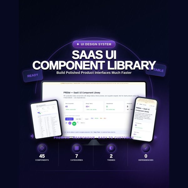
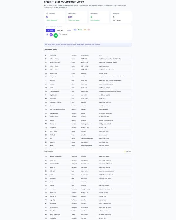
Building a consistent SaaS interface from scratch means hours spent naming color variables and rebuilding the same buttons and modals project after project. PRISM replaces that with a single, self-contained HTML file: a fully interactive component library with 45 production-ready UI components, a token system, and a live theme editor, ready to copy into your own project.
There is no npm package to install and no framework required. Open index.html in a browser and you have a permanent, working reference for every component your SaaS interface needs, plus the CSS custom properties behind them.
Key Features
- 45 production-ready components — across seven categories: actions, forms, feedback, layout, navigation, data display, and marketing.
- 60-plus CSS design tokens — colors, typography, spacing, radii, shadows, and transitions, all exposed as CSS custom properties you can override in one place.
- Live theme controls — adjust your primary color hue, saturation, lightness, and border radius directly in the browser and watch every component update instantly.
- Built-in dark mode — a single data-theme=”dark” attribute toggle switches the entire library.
- Copyable snippets — every component shows a copy-ready HTML block you can click to copy and paste directly into your project.
- Command palette — press Cmd+K or click the topbar button to search components by name.
- Accessibility built in — ARIA roles, keyboard navigation, visible focus states, screen-reader announcements, and reduced-motion support throughout.
- Five responsive breakpoints tested — 360, 390, 768, 1280, and 1440 pixels.
- Zero external dependencies — no CDN fonts, no remote API calls, and no third-party tracking; system fonts fall back gracefully.
What’s Included
9 files, delivered as one ZIP (HTML, MD, PDF, TXT).
- Product/PRISM_Component_Library/ — index.html, the complete interactive component library with inline CSS and JavaScript
- Bonus/ — Component_Checklist.md, Token_Reference_Card.md
- Documentation/ — Quick_Start_Guide.md, Quick_Start_Guide.pdf, README.md
- License/ — License.txt
- Root files — Product_Specification.md, QA_Report.txt
Who This Is For
- Frontend developers — who want a working component reference instead of rebuilding buttons and modals from scratch.
- SaaS founders without a design team — who need a coherent visual system fast.
- Product designers — who want a live, browsable component set to hand off to engineering.
- Agencies and freelancers — delivering consistent UI across client projects under the commercial license.
- Teams building on LUMEN, CLARITY, or SIGNAL — who want a matching component set using compatible design tokens.
Why Choose PRISM
- Not an npm package, and that is the point — there is nothing to install, update, or worry about breaking; you copy plain HTML and CSS.
- Live theme editing built in — test your brand colors against every component before you commit to a palette.
- Dark mode without extra work — a single attribute switches the whole library, tokens included.
- Accessibility is not an afterthought — keyboard support and ARIA states are already built into every component.
How To Use
- Unzip the download and open Documentation/Quick_Start_Guide.pdf for the setup walkthrough.
- Open Product/PRISM_Component_Library/index.html in a browser to explore all 45 components and try the live theme controls.
- Copy the :root token block into your own stylesheet, then use the theme editor to find your brand color values.
- Click Copy on any component to grab its ready-to-use HTML snippet and paste it into your project.
- Use the Component_Checklist.md to confirm accessibility and integration for every component you adopt.
Frequently Asked Questions
What format are the files? One ZIP containing a single self-contained HTML file with inline CSS and JavaScript, plus Markdown and PDF guides, a specification file, a QA report, and a license file.
Can I edit the files? Yes. index.html and every component snippet inside it are fully editable, and the design tokens can be overridden freely.
What software do I need? A web browser to explore the library, and a code editor to copy snippets into your own project. No build tools are required.
Is this for personal or commercial use? Both. The license covers personal projects, your own business, and client work. Reselling, redistributing, or sharing the source files as a standalone template or competing product is not permitted.
What is the refund policy? As a digital download, PRISM is non-refundable once downloaded. If a file is missing or corrupted, contact support and it will be replaced.
Is PRISM an npm package or a React component library? No. It is a static HTML/CSS/JS reference file. There is no npm package and no React, Vue, or Angular version included; you copy plain HTML and CSS snippets into your own project.
How many components and tokens does it include? 45 components across seven categories, plus a Kanban board and usage meter as bonus components, and more than 60 design tokens covering color, typography, spacing, radii, shadows, and transitions.
Does dark mode require extra setup? No. Toggling the data-theme=”dark” attribute switches the entire library, tokens included, with no separate stylesheet needed.
Bonus Materials
Two reference documents are included beyond the library itself: the Component Integration Checklist, a 45-item accessibility and integration QA checklist with one row per component for use during your build, and the Token Reference Card, a one-page reference of all 60-plus design tokens with their values and quick brand customization examples.




Reviews
There are no reviews yet.