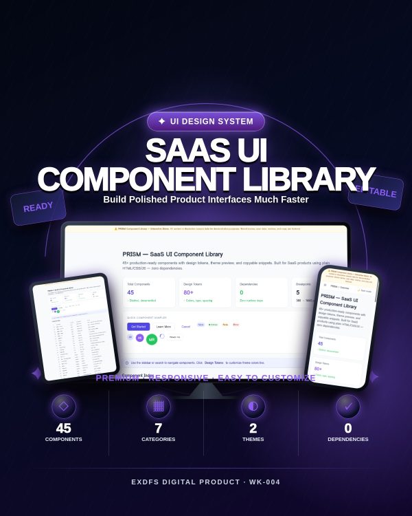
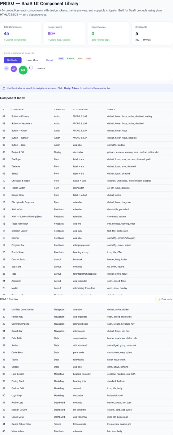
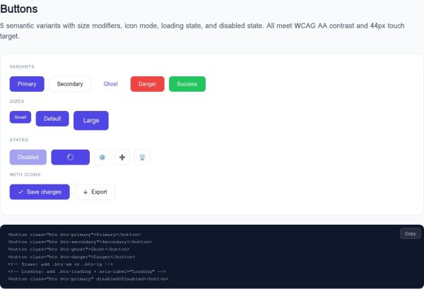
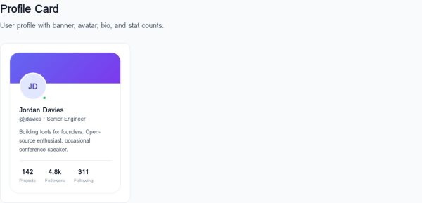

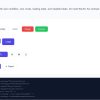

PRISM is a complete, self-contained SaaS UI component library built for founders, developers, and product teams who need a proven visual system — not another npm install. Open index.html in any browser and you have a fully interactive component showcase with 45 production-ready UI components, 60+ design tokens, a live theme editor, and copyable HTML snippets. No framework. No build step. No dependencies.
What You Get
- 45 production-ready components across 7 categories: actions, forms, feedback, layout, navigation, data display, and marketing
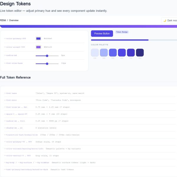
- 60+ CSS design tokens — colors, typography, spacing, radii, shadows, and transitions — all as CSS custom properties you can override in one place
- Live theme controls — adjust your primary color hue, saturation, lightness, and border radius directly in the browser and see all components update instantly
- Dark mode built in — one attribute toggle (
data-theme="dark") switches the entire library - Copyable snippets — every component shows a copy-ready HTML block; click Copy and paste into your project
- Command palette — press ⌘K or click the topbar button to search components by name
- Accessibility built in — ARIA roles, keyboard navigation, visible focus, screen-reader announcements, and
prefers-reduced-motionsupport throughout - 5 responsive breakpoints — tested at 360, 390, 768, 1280, and 1440 px
- Zero external dependencies — no CDN fonts required (system fonts fall back gracefully), no remote API calls, no third-party tracking
Component List
01 Button Primary · 02 Button Secondary · 03 Button Ghost · 04 Button Danger · 05 Button Icon & Loading · 06 Badge / Pill
07 Text Input · 08 Textarea · 09 Select · 10 Checkbox · 11 Radio Button · 12 Toggle Switch · 13 Range Slider · 14 File Upload / Dropzone
15–18 Alerts (Info, Success, Warning, Error) · 19 Toast Notification · 20 Skeleton Loader · 21 Spinner · 22 Progress Bar · 23 Empty State
24–25 Cards · 26 Stat Card · 27 Tab Bar · 28 Accordion · 29 Modal Dialog
30 Breadcrumbs · 31 Dropdown Menu · 32 Mini Icon Nav · 33 Nested Nav · 34 Command Palette · 35 Search Bar
36 Data Table · 37 Avatar & Group · 38 Code Block · 39 Tooltip · 40 Stepper
41 Hero Section · 42 Pricing Card · 43 Feature Grid · 44 Logo Strip · 45 Profile Card + Kanban Board & Usage Meter (bonus components)
What This Product Is — and Isn’t
PRISM is a static HTML/CSS/JS reference file. You receive one index.html file that runs in any browser with no server required. There is no npm package, no React/Vue/Svelte version, and no hosted service included in this purchase.
- ✅ Copy any component snippet into your HTML project
- ✅ Copy the `:root` token block into your stylesheet
- ✅ Use the interactive demo as a permanent internal reference
- ✅ Host the single-file demo on any static host if you want a team reference URL
- ❌ This is not an npm package or framework component library
- ❌ There is no backend, database, or hosted service
- ❌ No React, Vue, Angular, or Svelte versions included
Bonuses Included
- Component Integration Checklist — 45-item accessibility and integration QA checklist, one row per component, ready to use during your project build
- Token Reference Card — Complete one-page reference of all 60+ design tokens with values, default colors, and quick brand customization examples
FAM-WK-001 Family Context
PRISM is WK-004 in the AI/SaaS Launch System family. The token system is designed to be compatible with WK-001 (LUMEN landing page) and WK-002 (CLARITY pricing page). If you use two or more products in this family, you can align your design system by sharing one `:root` token block.




Reviews
There are no reviews yet.